

😏 h&m 고객 데이터를 가지고 시각화 실습 : 미니과제를 풀어보자!!
▶ 사전 준비 과정 → 라이브러리 임포트 | 한글 인코딩 해결 | 데이터 불러오기
# 공통 셋업
import pandas as pd
import seaborn as sns
import matplotlib.pyplot as plt
plt.rcParams["font.family"] = "AppleGothic" # windowsms Malgun Gothic 권장
plt.rcParams["axes.unicode_minus"] = False
%matplotlib inline
# 데이터 로드
hm_path = "customer_hm.csv"
hm = pd.read_csv(hm_path)
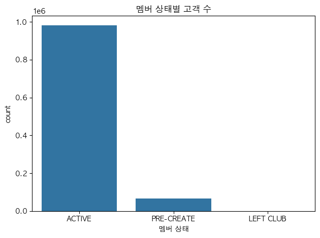
hm.head()문제1. 멤버 상태별 고객 수
질문) 멤버 상태별 고객 수는 어떻게 분포할까?
그래프) 범주 → 빈도!! → countplot(): 고객수
hm_status = (hm['club_member_status']
			.value_counts()
            .sort_values(ascending=False)
            .index        # <<< 멤버상태인 index가 곧 고객수(분포)! 그걸 뽑아줘야 함!
            )
print(hm_status)          # <<< 한 번 출력해보고

>>> 출력:
Index(['ACTIVE', 'PRE-CREATE', 'LEFT CLUB'], dtype='object', name='club_member_status')
# 시각화: 막대그래프
sns.countplot(data=hm, x='club_member_status', order=hm_status)
plt.xlabel("멤버 상태")
plt.title("멤버 상태별 고객 수")
plt.tight_layout()
plt.show()▼ 그래프 확인
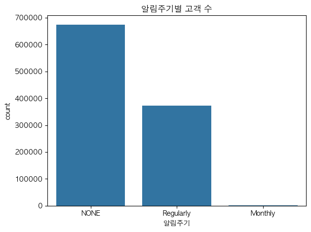
문제2. 패션뉴스 알림주기별 고객 수
질문) 패션뉴스 알림주기에 따라 고객수는 어떻게 분포하지?
그래프) 범주 → 빈도 → countplot(): 고객수
order = (hm['fashion_news_frequency']
	.value_counts()
        .sort_values(ascending=False)
        .index)
sns.countplot(data=hm, x='fashion_news_frequency', order=order)
plt.title("알림주기별 고객 수")
plt.xlabel("알림주기")
plt.tight_layout()
plt.show()▼ 그래프 확인
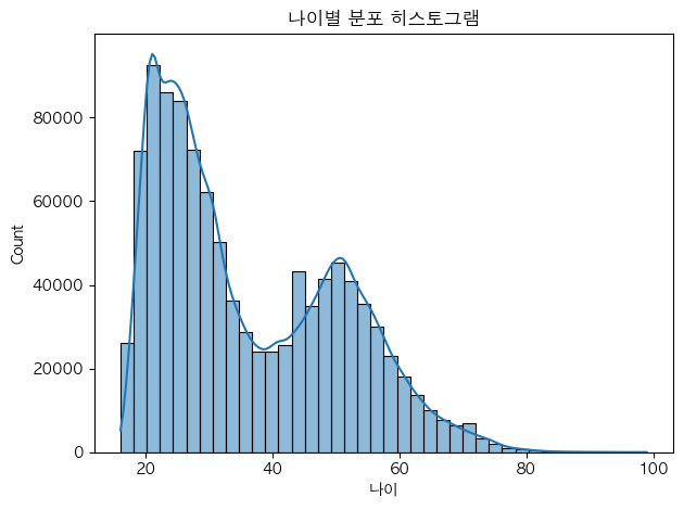
문제3. 나이 분포
질문) 나이 분포는 어떻게 될까?
그래프) 수치 → 분포 모양 → 히스토그램 : 보통 나이, 가격 등
sns.histplot(data=hm, x='age', bins=40, kde=True)    # <<< kde=True : 선
plt.title("나이별 분포 히스토그램")
plt.xlabel("나이")
plt.tight_layout()
plt.show()
▼ 그래프 확인
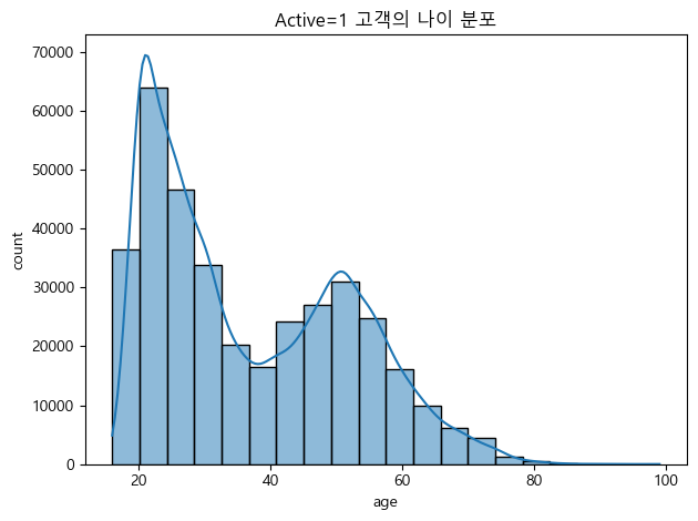
문제4. Active = 1 인 고객의 나이 분포
질문) Active = 1인 고객의 나이 분포는 어떻게 나타날까?
그래프) 나이 분포 → 히스토그램
hm_active = hm[hm['Active'] == 1].dropna(subset=['age'])
print('표본 수:', len(hm_active))
# 시각화
sns.histplot(data=hm_active, x='age', bins=20, kde=True)
plt.title('Active=1 고객의 나이 분포')
plt.xlabel('age'); plt.ylabel('count')
plt.tight_layout(); plt.show()▼ 그래프 확인
문제5. 멤버 상태별 나이 분포
질문) 멤버 상태에 따라 나이 분포가 어떻게 다르게 나타날까?
그래프) 범주 x 수치 : 박스플랏 / 바이올플랏 : 그룹별 분포, 중앙값, 이상치 확인 가능!
# 결측치 제거하고
hm_age = hm.dropna(subset=['age'])
# 범주 x 수치 >>> 박스플랏/바이올린플랏
sns.boxplot(data=hm_age, x='club_member_status', y='age')
plt.title('멤버 상태별 나이 분포 (Boxplot)')
plt.xlabel('club_member_status'); plt.ylabel('age')
plt.tight_layout(); plt.show()▼ 그래프 확인

문제6. 멤버 상태별 평균 나이
질문) 멤버 상태별 평균 나이는 어떻게 될까?
그래프) 범주 x 수치(평균) : barplot
# 멤버상태별 평균 나이를 구하고, 큰 값부터 정렬
avg_age = (hm.dropna(subset=['age'])
              .groupby('club_member_status')['age']
              .mean()
              .reset_index(name='avg_age'))
order = avg_age.sort_values('avg_age', ascending=False)['club_member_status']
print(order)

>>> 출력:
2    PRE-CREATE
0        ACTIVE
1     LEFT CLUB
Name: club_member_status, dtype: object
sns.barplot(data=avg_age, x='club_member_status', y='avg_age', order=order, errorbar=None)
plt.title('멤버 상태별 평균 나이')
plt.xlabel('club_member_status'); plt.ylabel('avg_age')
plt.tight_layout(); plt.show()▼ 그래프 확인

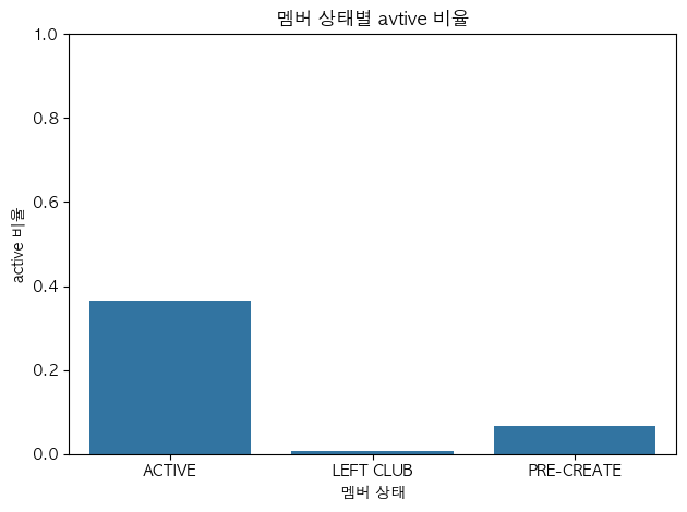
문제7. 멤버 상태별 Active 비율
질문) 멤버 상태별로 Active 비율은 어떻게 나타나?
그래프) 범주 x 수치(비율) > barplot 막대그래프
# seaborn은 데이터프레임과 함께 쓰인다.
# => .reset_index(name='**') : 시리즈를 데이터프레임으로 만드는 역할(?)
# => **은 y축에 명시!

active_mean = (hm.groupby('club_member_status')['Active']
              .mean()
              .reset_index(name='active_rate'))
sns.barplot(data=active_mean, x='club_member_status', y='active_rate', errorbar=None)
plt.title("멤버 상태별 avtive 비율")
plt.xlabel("멤버 상태")
plt.ylabel("active 비율")
plt.ylim(0, 1)
plt.tight_layout()
plt.show()▼ 그래프 확인
문제8. 알림주기 별 Active 비율
질문) 알림주기별로 Active 비율은 어떻게 되려나??
그래프) 범주 x 수치(비율) > barplot 막대그래프
# 🚨시리즈와 데이터프레임에서 .sort_values() 할 때의 차이점!!! 구분하기

fn_fre_active = (hm.groupby('fashion_news_frequency')['Active']
                .mean()
                .reset_index(name='active_mean'))
print(fn_fre_active)
order = fn_fre_active.sort_values(by='active_mean', ascending=False)['fashion_news_frequency']
print(order)                                                         # 👆[''] 뽑아올 컬럼 즉, x축
sns.barplot(data=fn_fre_active, x='fashion_news_frequency', y='active_mean', order=order, errorbar=None)
plt.ylim(0, 1)
plt.title("알림 주기별 Active 비율")
plt.xlabel("알림 주기"); plt.ylabel("Active 비율(%)")
plt.show()▼ 그래프 확인

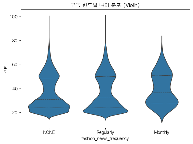
문제9. 알림 주기별 나이 분포 (바이올린)
질문) 알림주기별 나이 분포가 어떻게 다른지?
그래프) 범주 x 수치(연속) > 박스플랏 또는 바이올린플랏
hm_age = hm.dropna(subset=['age'])sns.violinplot(data=hm_age, x='fashion_news_frequency', y='age', inner='quartile')
plt.title("알림주기 별 나이 분포")
plt.xlabel("알림주기")
plt.ylabel("나이")
plt.tight_layout()
plt.show()▼ 그래프 확인
문제10. 나이와 FN(구독여부)의 관계 (색상으로 구분)
질문) 나이와 FN(구독여부) 사이의 관계는 어떻게 될까?
그래프) 수치 x 수치(0/1) > 산점도 scatterplot
tmp = hm.dropna(subset=['age']) # << 결측치 제거# ✅ hue= : 해당컬럼의 값들을 색상으로 구분해줘!
sns.scatterplot(data=tmp, x='age', y='FN', hue='club_member_status')
plt.title('나이 vs FN (멤버 상태 색상 구분)')
plt.xlabel('age'); plt.ylabel('FN')
plt.tight_layout(); plt.show()▼ 그래프 확인

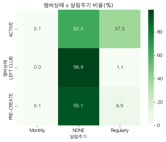
문제11. 멤버 상태 x 알림 주기 (행 기준 비율 히트맵)
질문) 멤버 상태와 알림 주기 사이 관계는 어떨지 궁금해.
그래프) 범주 x 범주 : 히트맵!! (<< crosstab 선 진행 후 히트맵)
cross_tab = pd.crosstab(hm['club_member_status'], hm['fashion_news_frequency'], normalize='index') * 100
print(cross_tab)

>>> 출력:
fashion_news_frequency   Monthly       NONE  Regularly
club_member_status
ACTIVE                  0.062180  62.414286  37.523534
LEFT CLUB               0.000000  98.885794   1.114206
PRE-CREATE              0.071667  93.074214   6.854119
# ✅ annot=True : 각 히트맵 안에 수치 적어줘
# ✅ fmt='.1f' : 비율을 소수 첫째자리까지만 보여줘
# ✅ cmap='Greens' : 히트맵 컬러를 지정해줘
sns.heatmap(cross_tab, annot=True, fmt='.1f', cmap='Greens')
plt.title("멤버상태 x 알림주기 비율(%)")
plt.xlabel("알림주기"); plt.ylabel("멤버상태")
plt.show()▼ 그래프 확인
문제12. 알림주기별 나이 분포 ( 패싯 히스토그램, facet histogram )
질문) 패션뉴스 알림주기별 나이는 어떻게 분포하려나?
그래프) 범주 x 수치(연속)? 분포니깐 : 히스토그램!!
💡 한 화면에 범주별 분포를 비교하려면 패싯이 편리하다. 같은 축 범위를 공유하면 패널 간 비교가 쉬워져!!
hm_age = hm.dropna(subset=['age'])g = sns.FacetGrid(hm_age, col='fashion_news_frequency', col_wrap=4, sharex=True, sharey=True)
g.map_dataframe(sns.histplot, x='age', bins=20)
g.fig.suptitle('구독 빈도별 나이 분포 (Facet)', y=1.02)
plt.show()▼ 그래프 확인

➡️ Monthly를 보고싶다면 패널마다 y축 독립을 수행하면 됨. sharey=True 옵션!
hm_age = hm.dropna(subset=['age'])
g = sns.FacetGrid(hm_age, col='fashion_news_frequency', col_wrap=3,
                  sharex=True, sharey=False)   # ← 핵심
g.map_dataframe(sns.histplot, x='age', bins=20)
g.fig.suptitle('구독 빈도별 나이 분포 (Facet)', y=1.02)
plt.show()
문제13. 수치형 변수 상관관계 (상관 히트맵)
데이터의 수치형 변수들 사이 상관관계를 히트맵으로 표현하고, 값도 표시한다!.
강한 양/음의 상관이 보이는지 살펴보자!
num = hm.select_dtypes(include='number')
# 수치형 열이 1개라면 굳이 상관 히트맵을 볼 필요가 없다
if num.shape[1] >= 2:
    corr = num.corr()
    sns.heatmap(corr, annot=True, fmt='.2f', vmin=-1, vmax=1, center=0)
    plt.title('수치형 상관관계 히트맵')
    plt.tight_layout(); plt.show()
else:
    print('수치형 열이 2개 미만입니다.')
하... 이건 해설이 필요할 것 같은데...ㅠ
▼ 그래프 확인

... 복습이 필요하겠지? 😩
끝.